Start your painting project with an expert color consultation designed to ensure every color works beautifully with your home—before painting begins.
Color shapes how a home feels. It influences how light reflects, how finishes interact, and how rooms connect to one another.
Choosing the right palette requires more than simply selecting a shade you like. The best colors are chosen by carefully considering:
Without expert guidance, it can be difficult to see how all of these elements work together. A professional color consultation brings them into alignment to create a palette that feels balanced, cohesive, and natural—so you can curate your home’s atmosphere with 100% Color Confidence.
Repainting is a meaningful investment in your home, which makes getting the colors right the first time especially important.
Many homeowners spend weeks—or even months—trying to choose the right paint colors. With professional guidance, that process becomes clear, efficient, and enjoyable.
Clients often say the biggest benefit is simply having an expert sounding board who can:
When we built our home, I wanted the color palette to feel cohesive, understated, and supportive of the architecture and views rather than competing with them. The house has a lot of light and expansive windows, so it was important that the interiors feel calm and refined—but not generically off-white. Tami was incredibly helpful in taking my broad ideas and narrowing them into specific color directions that truly worked. Her eye for color and ability to create flow from room to room made the process so much easier. Even years later, I still love the palette and feel the choices were exactly right for our home.
I knew I had taken on a great responsibility when purchasing the house four years ago. It was a house designed out of love in the early ’90s by an architect for his wife, lovingly referred to as the ‘grand dame’ in honor of its femininity and strength. The paint colors we chose, from the English green in the dining room to the smile-inducing ‘Marry Me Pink’ on the primary bedroom ceiling, reflect the home’s mood and have garnered numerous compliments. I feel our grande dame is radiant in her new palette. As the interior designer, I cherished having a color expert partner like Tami to bounce ideas off of. Our collaboration—particularly on palette selection—was critical to the project’s success.
When we decided to replace the windows on our 1940s bungalow, we realized it was also a perfect opportunity to rethink the home’s twenty-year-old exterior palette. What began as a simple update turned into a complete transformation with Tami’s help. She worked with us collaboratively, helping refine ideas and guiding us toward a palette that felt timeless and sophisticated. We moved from creamy yellow and sage green to a warm gray-green with charcoal accents and white trim, and the difference is remarkable. Friends now ask if we remodeled the house.
Tracey and Todd Bradshaw, Homeowners
With such a modern home and strong architectural elements, we knew the color palette had to be handled thoughtfully. Tami helped guide us toward choices that felt clean, balanced, and appropriate for the architecture. She understood how the colors needed to work with the concrete floors, wood elements, and metal details throughout the house. The result is a palette that feels intentional and refined, and it truly allows the design of the home to shine.
Why the Elevated Color Method™ Works
Color decisions affect every room and surface in your home. Without guidance, it’s easy to choose colors that feel disconnected or uncertain.
The Elevated Color MethodTM ensures that:
Most importantly it allows homeowners to move forward with complete confidence in their color decisions.
Every successful color palette begins with understanding the home itself.
During this step we evaluate:
This ensures color decisions are grounded in the true character of the home.
Next, we establish the overall mood and palette direction for the home.
Examples may include:
Rather than jumping straight to specific paint colors, we first define the design intention that will guide every color decision.
With a clear direction established, we begin narrowing the possibilities.
You’ll see carefully selected color options that work with:
Instead of sorting through hundreds of choices, we focus only on colors that truly belong in your space.
Color behaves very differently in real environments than it does on a paint chip.
Large sample boards allow you to see how each color changes with:
This step ensures the palette works beautifully before any paint is ever applied.
By the end of the consultation, you’ll have a clear, cohesive, and detailed color plan for your home.
This may include:
The result is a palette that feels cohesive, balanced, and intentional throughout the entire home.
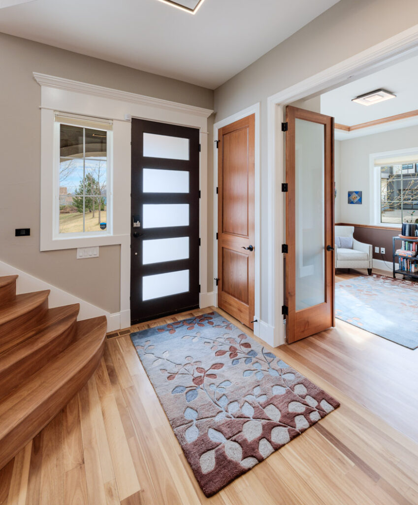
Boulder-based color consultant Tami Petrarca (formerly Maurer) built her career from the ground up, beginning hands-on in the painting trade before going on to build one of the area’s most respected high-end residential painting companies for over 20 years.
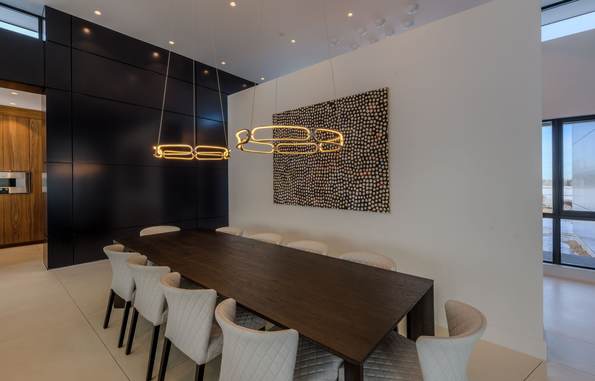
Known for noticing the details many painters overlook — crisp caulk lines, clean color transitions, flawless finishes, and overall visual harmony — Tami combines technical expertise with a highly trained eye for color and design. Over the years, she has guided homeowners throughout Boulder County through paint color selection, finish choices, and the countless small decisions that elevate a home from beautifully painted to truly exceptional. Her experience spans luxury residential homes, remodels, new construction, prep-for-sale projects, and cabinet refinishing.
Tami has also become a trusted resource for many of the area’s architects, builders, and interior designers. Her reputation has been built through consistent quality, thoughtful guidance, clear communication, and a genuine commitment to both clients and crews.